I seen a display in Debenhams the other day, for garden furniture. I think it looks great and like the colours together.
I am liking greens and white together at the minute. Gives a natural calming feel to it.
I definitely think this style of furniture and blend of colours would go great outdoors.
Wednesday, 30 March 2011
Monday, 21 March 2011
Trump Hotel
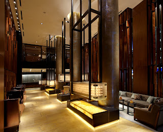
In February 2010, The Trump Hotel in Soho, New York, opened. As it's a fairly new building, the interior is quite modern, and the views from the rooms are great as it is just a glass tower. I love this hotel, and think it is probably one of the best in Manhattan.
Saturday, 19 March 2011
More Helena Michel
The position of the lighting in the image, gives a calm and relaxing atmosphere, which is what you want for a bathroom. Rendering 3D models can look great, but they always look better when you can see the lighting.
Again, minimal base colours, with white walls, floor and ceiling, and colour given in some of the furniture and the scenery. I like the mix of modern, and old wooden beams with bare brick walls.
Wednesday, 16 March 2011
Collins College
Collins College, in Phoenix, Arizona, is another design by IA. I've seen other parts of the building's interior, but my favourite part is the reception area.
I love the bold blue, white and silver theme, I think it's very effective, and so are all the square shapes. The lighting above the college logo glows down, and hits the top of the metal lettering.
Friday, 11 March 2011
Helena Michel
I found an Interior Designer I really like a few months ago. She has her own page on SketchUp and uploads quite a few models.
Her designs are always modern, and she uses colours that blend well together. I like the way she uses lighting in her designs because it usually makes them look bold and dramatic.
The use of natural materials on vast parts of her buildings, such as stone and wood, creates a great effect, along with all the glass which lets on sunlight. in the photo above there is a small pool inside the house, which also adds to the modern/natural atmosphere.
Thursday, 10 March 2011
Co Co. Sala
'Co Co. Sala' is a Restaurant and a Chocolate Boutique that opened in May of 2008. Throughout the building there are walls that appear to have incurvated, which I think personally looks quite good, although the rest of the interior style is not to my taste, I do like that idea.
This was designed by the firm IA Interior Architects, which is based in the US, but deal with clients around the world.
This was designed by the firm IA Interior Architects, which is based in the US, but deal with clients around the world.
Subscribe to:
Posts (Atom)


